Overview
|
Overview |
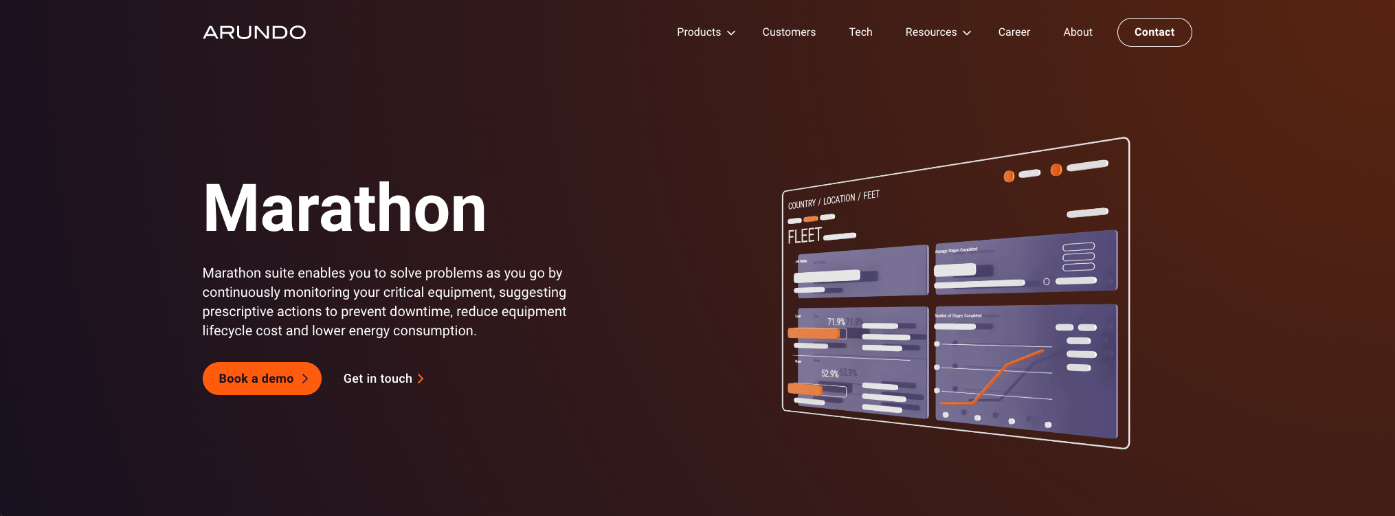
Marathon is an online collaborative platform for energy industry companies to manage their assets and monitor the performance in the field. It detects asset performance anomaly and prevents upcoming failure, achieving great cost saving.
Industry
B2B Data Analytics
Platform
Browser, Tablet (ongoing)
Role
Design Lead, UX Research, QA
Date
2020 - Present
225%
Increase in user engagement
$900,000
Annual revenue per signed client
$15,000
Client savings per failure prevention
Product Definition
|
Product Definition |
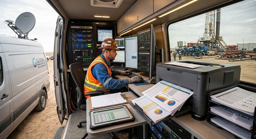
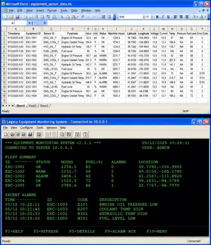
On our first field visit to a West Texas crude‑oil site, the lead engineer was juggling an Excel file, a legacy monitoring terminal, and a printed shift log — pasting values between them by hand. Every failure they missed cost about $15K in downtime and parts.
The interesting part: they weren't asking for “a dashboard.” They were asking for “less swiveling.” That distinction became my north star.
Engineers were losing money in the gaps between tools.
Problem Surfaced
Avg. failure cost
Downtime + parts
Anomaly detection lag
Observed on site
Engineer trust in tools
"I trust the sound, not the screen"
$15,000
2-6 Hrs
Low
Arundo is a startup selling into oil & gas — an industry that buys on trust, references, and Excel compatibility. The product had to be visually credible to a VP in a boardroom and usable by a field engineer on a 10" tablet in gloves. Those two audiences almost never appear on the same slide, but they signed the same contract.
Selling a $900K ARR product into a conservative industry.
Business Context
Research Method
Site visits with field engineers — contextual inquiry, shadow shifts.
Biweekly interviews with fleet managers across three client accounts.
Workflow mapping from Excel + legacy monitor to a single canvas.
Hotjar behavior tracking on the beta to validate hierarchy after launch.
Field first, dashboard second.
Two users, one product
Field engineer
Needs glanceable status, alert triage, and asset drill‑down. Reads on tablet, often outdoors.
Daily
Fleet manager
Needs performance trends, cost saved, exportable reports for the executive review.
Weekly
Two directions were pushed to hi‑fi and put in front of both audiences. We optimized for field engineers first — if the daily user rejects it, the weekly user never gets the value.
Design Direction
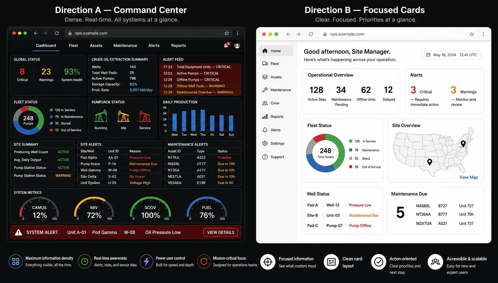
Direction A
Command Center
Dense cockpit — every asset, gauge, and alert visible at once. Loved by fleet managers in demos.
Ruled Out
Why ruled out
We needed both field engineers and fleet managers to quickly prioritize and locate what to focus on. The command center buried priorities under noise; it slowed triage for both audiences instead of speeding it up.
Direction B
Focused Cards
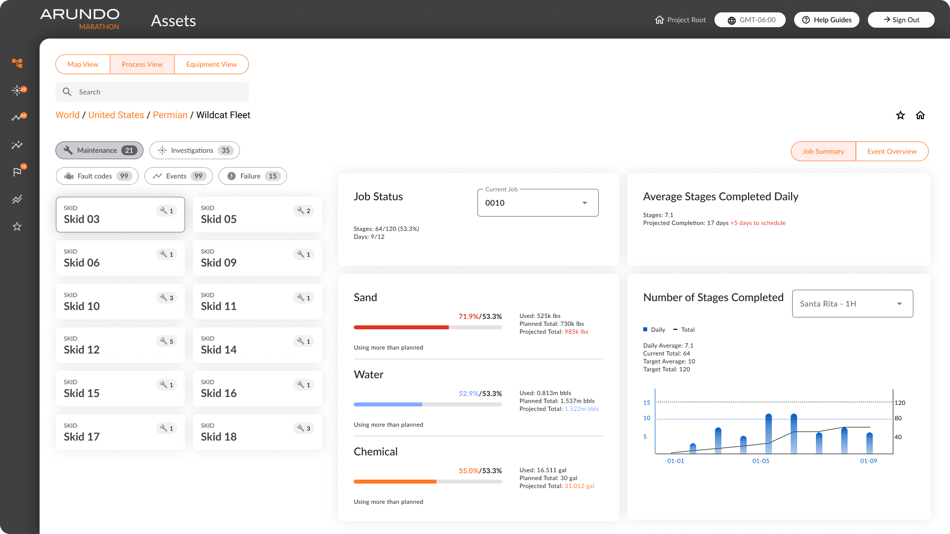
Fewer big tiles, clear priorities, generous whitespace. Reads left‑to‑right, top‑to‑bottom in priority order. Tablet‑friendly hit targets. Fleet managers get their trend view one click deeper — a trade we validated in interviews.
Chosen
Where reality edited the design.
Constraints that shaped decisions
Three constraint categories drove more decisions than any style preference.
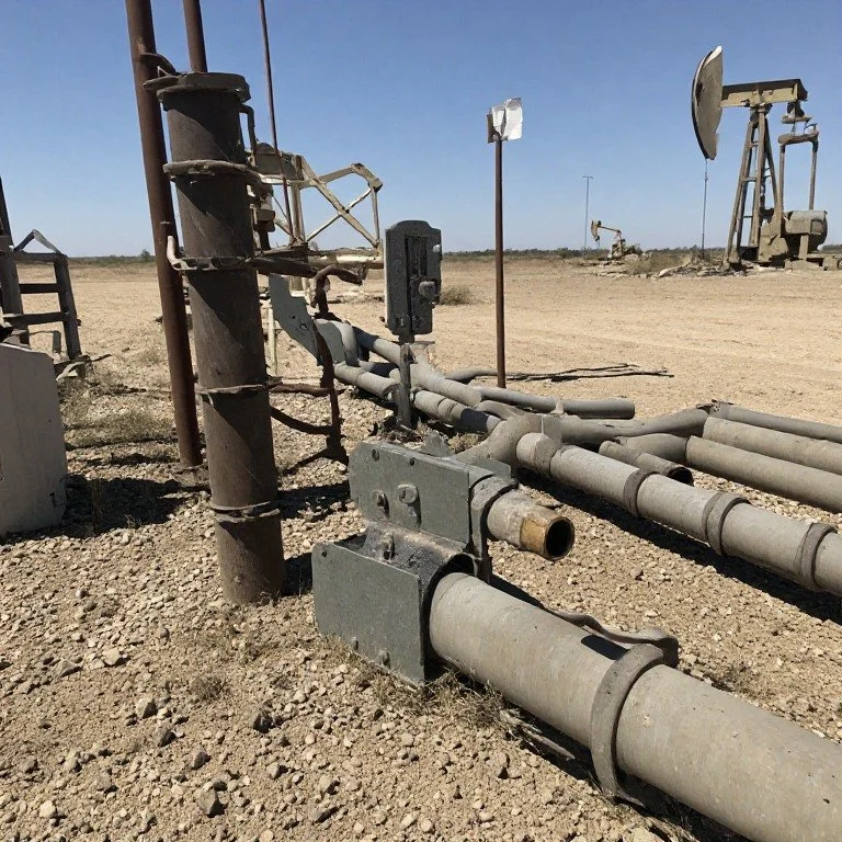
Operational (Urgency)
In crude oil fields, equipment failures require instant action. The UI bypassed exploratory menus to surface critical alerts immediately, preventing costly downtime.
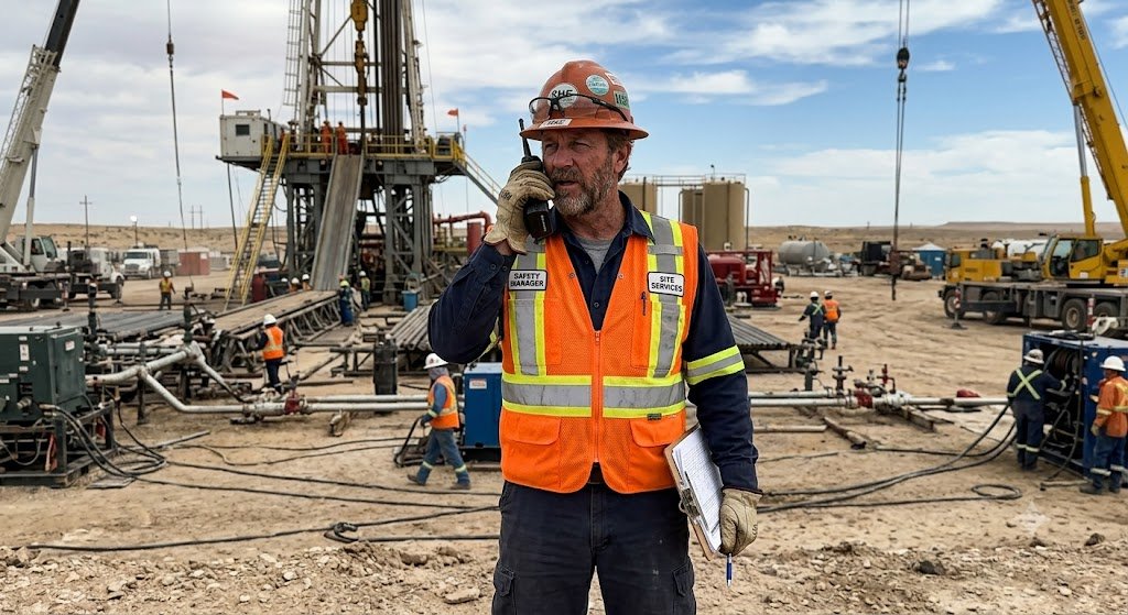
Environmental (Cognitive)
Cross-department engineers had to coordinate fixes in loud, chaotic environments. We used bold, unmistakable status colors that were easy to identify instantly at a glance.
Business (Mindset & Trust)
Older workers and partners preferred traditional layouts over modern charts. We prioritized direct, familiar Excel and PDF exports to drive user adoption and maintain business trust.
Before
After
Visualize The Workflow
|
Visualize The Workflow |
I translated the workflow into a design by prioritizing content and arranging it so the reading flow feels natural—from left to right and top to bottom—with higher-priority information presented first. I then tested and iterated the layout using analytics tools to track where users focused, adjusting the arrangement to ensure the most important information is seen first and is clear and simple enough for quick understanding.


Design Handoff And Followup
|
Design Handoff And Followup |
I collaborated closely with the product manager and software engineers in agile sprints, keeping the design consistently one sprint ahead of development. At the start of each dev sprint, I created tasks and subtasks in Atlassian Jira, providing developers with all the necessary details for each screen, including specs and expected behaviors. I maintained open communication to answer questions as they arose and conducted QA checks before any changes were published to ensure they matched the design. After release, we used Hotjar to track user interactions on the application. The new asset page quickly became the most-used page, and a few minor revisions were implemented in subsequent sprints based on observed user behavior.


Design System
|
Design System |
As product scales and UI design trend evolves, we updated our design system as well. Before overhauling the product design system, we updated our marketing / branding styles first. The goal for the design system update was not only to keep up with the UI trends, but also create a cohesive look and feel of the whole suite.

From left to right: old product, new marketing, new product
Overview
The new design system refreshes the product in many ways, from style to usability.
Marathon - before and after adopting the new design system

WCAG Compatible
The design system I created meets WCAG accessibility standards, ensuring all components—colors, typography, and interactions—support a consistent, inclusive, and easily navigable experience for all users.

From Figma to Development
A Kanban board was used to track work progress. It started from Figma to development to design QA and completion.


Retrospective
|
Retrospective |
For startups like Arundo, being able to precisely target user pain points and differentiate ourselves is key. I have had the experience to deal with ambiguity, work with international colleagues around time difference, and everything else that drove me towards a better designer. Marathon is now a rising service in the equipment analytics market serving multiple clients.


